“glmnet (Friedman et al. 2010) is a powerful R package for learning sparse models in supervised learning, but only its most basic capabilities are widely used. This book describes the full range of glmnet’s capabilities and provides code which readers can adapt for their own purposes.”
Tag: R
Interval vectors (ivs) in R
“ivs (said, “eye-vees”) is a package dedicated to working with intervals in a generic way. It introduces a new type, the interval vector, which is generally referred to as an iv. An iv is generally created from two parallel vectors representing the starts and ends of the intervals…”
Examples:
> iv_set_union(iv(2, pi), iv(3, 5))
[1] [2, 5)

> iv_set_union(iv(2, pi), iv(4, 5))
[1] [2, 3.141593) [4, 5.000000)

> iv_set_intersect(iv(0, pi), iv(3, 1000))
[1] [3, 3.141593)

> iv_set_union(iv(0, pi), iv(3, 1000))
[1] [0, 1000)

> iv_between(exp(1), c(iv(0, pi)))
[1] TRUE

> iv_between(pi, c(iv(0, pi)))
[1] FALSE{performance} package – model checking
The performance package computes indices of model quality and goodness of fit, including \(R^2\) (including for LMMs), RMSE, ICCs, and tests for overdispersion, zero-inflation, convergence, and singularity. It also simplifies posterior predictive checks for every model with a simulate function.
Trying elastic net regularisation with correlated predictors
First simulate data where \(x_1\) to \(x_3\) are identical and \(x_4\) is uncorrelated with them. Each \(x\) is a z-score.
Set \(y = 0.2 (x_1 + x_2 + x_3) + 0.3 x_4 + \epsilon\).
Now try elastic nets, varying \(\alpha\) from 0 (ridge regression) to 1 (lasso). I used 10‑fold cross‑validation to select \(\lambda\), keeping the coefficients for the smallest \(\lambda\), and used the same fold assignments across all values of \(\alpha\).
Here’s a picture of the coefficients. Note how the correlated predictor slopes separate as \(\alpha\) increases until only one survives with a slope of about three times 0.2 (to compensate for the other missing identical predictors). The uncorrelated predictor slope stays the same.

Here’s a table of coefficients for a selection of \(\alpha\), including the results from an unpenalised regression with only \(x_1\) and \(x_4\) as predictors:
| Variable | α = 0 | α = 0.9 | α = 1 | Unpenalised regression |
|---|---|---|---|---|
| (Intercept) | 0.002 | 0.002 | 0.002 | 0.002 |
| x1 | 0.198 | 0.243 | 0.600 | 0.603 |
| x2 | 0.196 | 0.188 | ||
| x3 | 0.195 | 0.169 | ||
| x4 | 0.271 | 0.287 | 0.287 | 0.290 |
Futures
I recently attended Henrik Bengtsson’s excellent UseR! 2026 workshop on the {futureverse}. Here are a few examples to show what it does.
Extended two-way fixed effects
selectTWFE looks interesting: “Estimates both a vanilla two-way fixed effects (TWFE) model and an extended TWFE (ETWFE) model, then selects between them using Cochran’s Q test for heterogeneity. When ETWFE wins, reports the heterogeneity fraction (I-squared) and cohort-time estimates with empirical Bayes shrinkage and Bonferroni multiplicity correction.”
Resignations
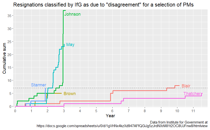
Interesting dataset from the Institute for Government. (I last updated this after Streeting resigned.)
Here’s a cumulative count of resignations that were coded by IfG as being due to “disagreement”, for a selection of PMs. The dashed horizontal line shows Starmer’s count:
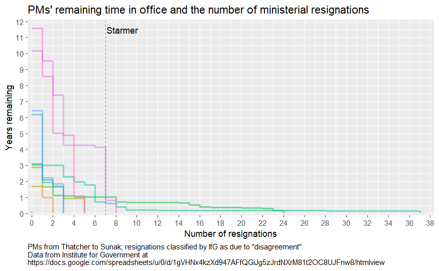
Expanding out to all PMs in the data (from Thatcher to Sunak), how long did they have left as the number of resignations grew? (Note: different colours – also remember the small number of PMs!)
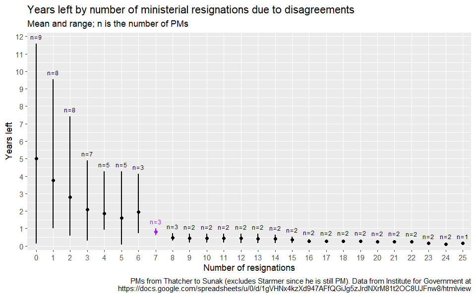
Another attempt to visualise (again, remember small n – the lines give a range not uncertainty!). Purple marks where Starmer is currently at, though the data excludes him since he’s still PM.
Counterfactual without a comparison group
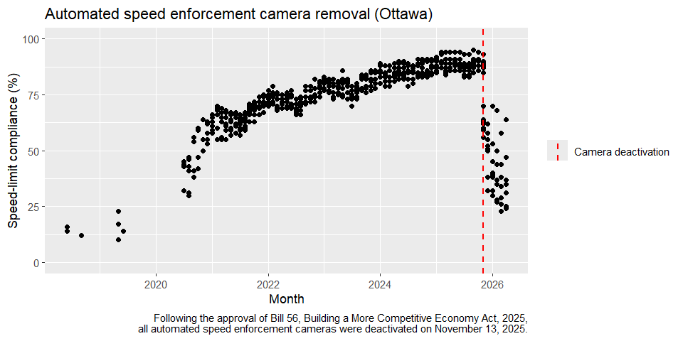
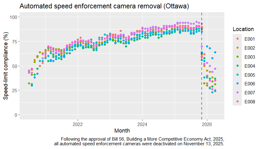
“Following the approval of Bill 56, Building a More Competitive Economy Act, 2025, all automated speed enforcement cameras were deactivated on November 13, 2025. The city has since been collecting and analyzing speed data at the original eight pilot locations to evaluate the impact of the camera removals. Monthly updates are provided for each site, including average speed, 85th percentile speed, speed-limit compliance rates, and the proportion of high-end speeders. This data is presented alongside baseline conditions prior to ASE camera installation and results observed during the enforcement period.”
Data here (hat tip @sjamieit.bsky.social). Here’s a pic, drawn using ggplot in R.
ggauto
“ggauto is designed to choose the best chart type, based on the type of data that you have. That means that you need to pre-process your data into the correct type before plotting it. This is a requirement to make ggauto possible, but is more generally a good idea because it forces you to understand what your data is before you plot it.”
Looks cool. Blog post here.
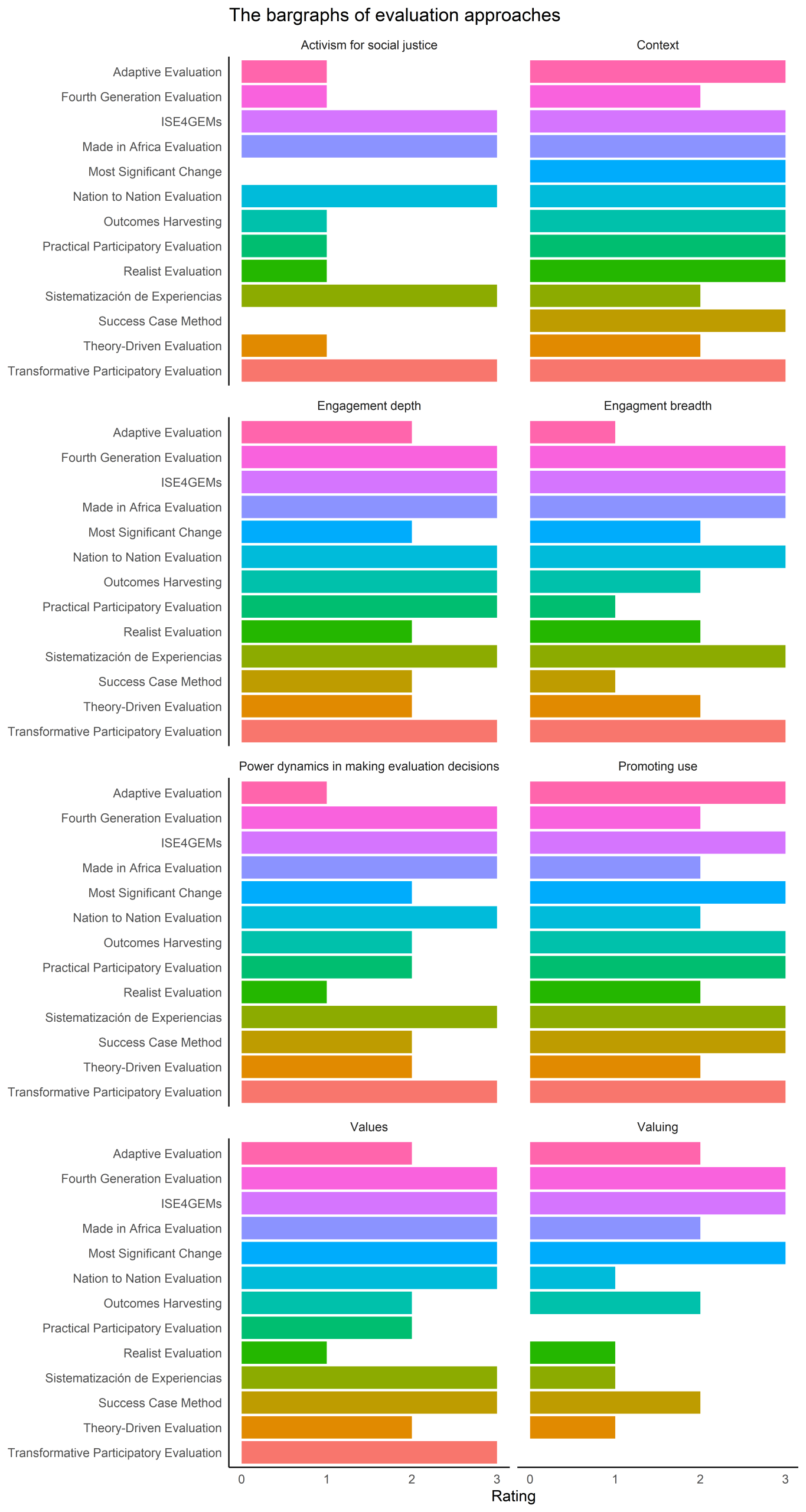
The bargraphs of evaluation approaches
Scroll down for a redrawing of Schröter, Becho, and Montrosse-Moorhead’s (2026) characterisation of broad evaluation approaches. R code here.
Their assessments of each approach on 8 dimensions are linked here:
- Adaptive Evaluation
- Fourth Generation Evaluation
- ISE4GEMs – Inclusive Systemic Evaluation for Gender Equality, Environments, and Marginalised Voices
- Made in Africa Evaluation
- Most Significant Change
- Nation-to-Nation Evaluation
- Outcome Harvesting
- Practical Participatory Evaluation
- Realist Evaluation
- Sistematización de Experiencias
- Success Case Method
- Theory-Driven Evaluation
- Transformative Participatory Evaluation
References
Schröter, D., Becho, L. W., & Montrosse-Moorhead, B. (2026). The garden of evaluation approaches: Supporting explicit, theory-informed evaluation practice. Evaluation.